
Four Fires Burn
Relationships
Four Fires Burn had the music. What it didn't have was a center.
Six players with roots from Havana to Tehran to Slovenia, blending Middle Eastern, Cuban, Brazilian, and jam-band influences — and a website that looked like a mom-and-pop band site. On stage and online, they read as a collective of talented people rather than one act.
The strategic call wasn't visual: release singles, not an album. An unknown band gets one moment from an album and many from singles — and every release is another chance to repeat the same idea.
That became the strategy for everything else: recursion and reinforcement. One motif, repeated at every scale until it's recognizable on sight.
Relationships strengthened
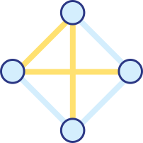
- Aesthetics ↔ Strategy (Vision — One act, many paths)
- Brand ↔ Aesthetics (Expression — A mark made to repeat)
- Brand ↔ Engineering (Architecture — A brand inside a template)
Vision
Many paths can read as no center. The answer started with what the band wears.
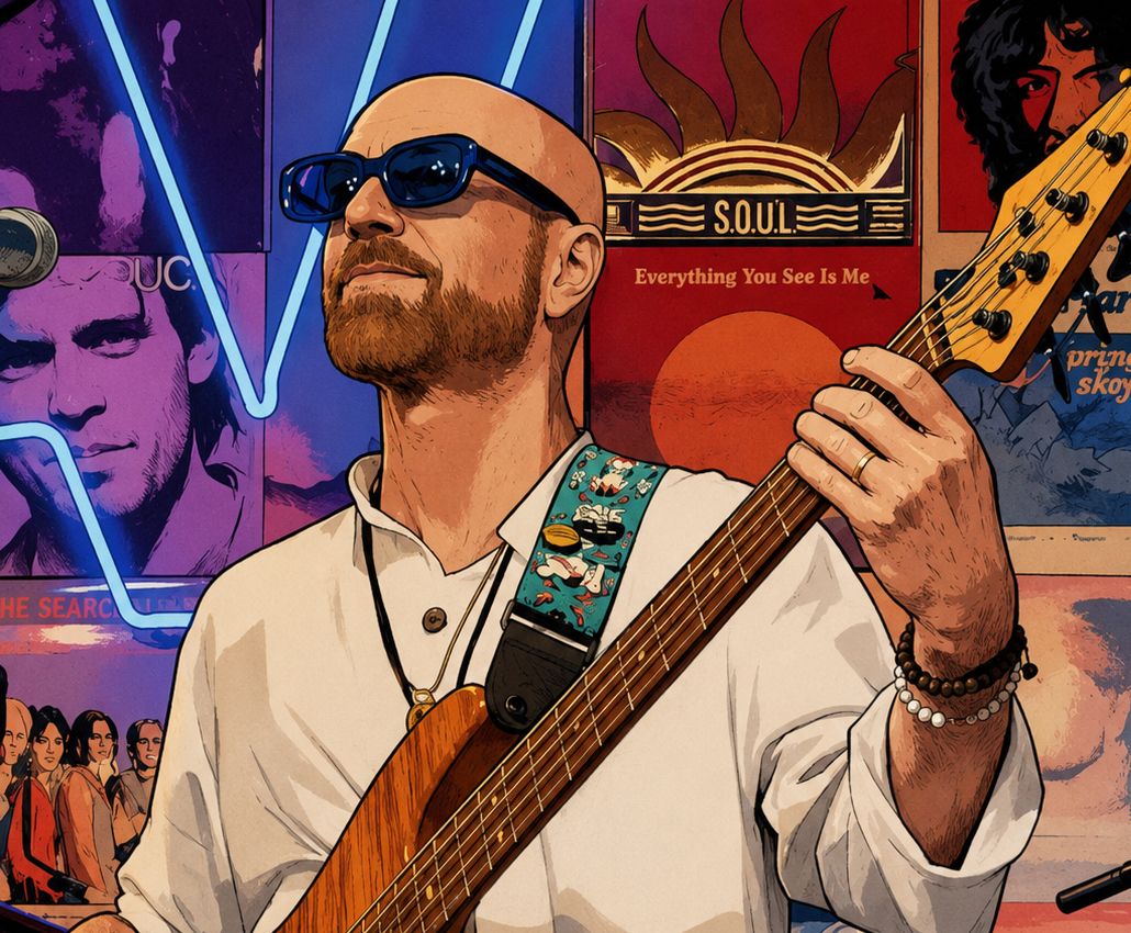
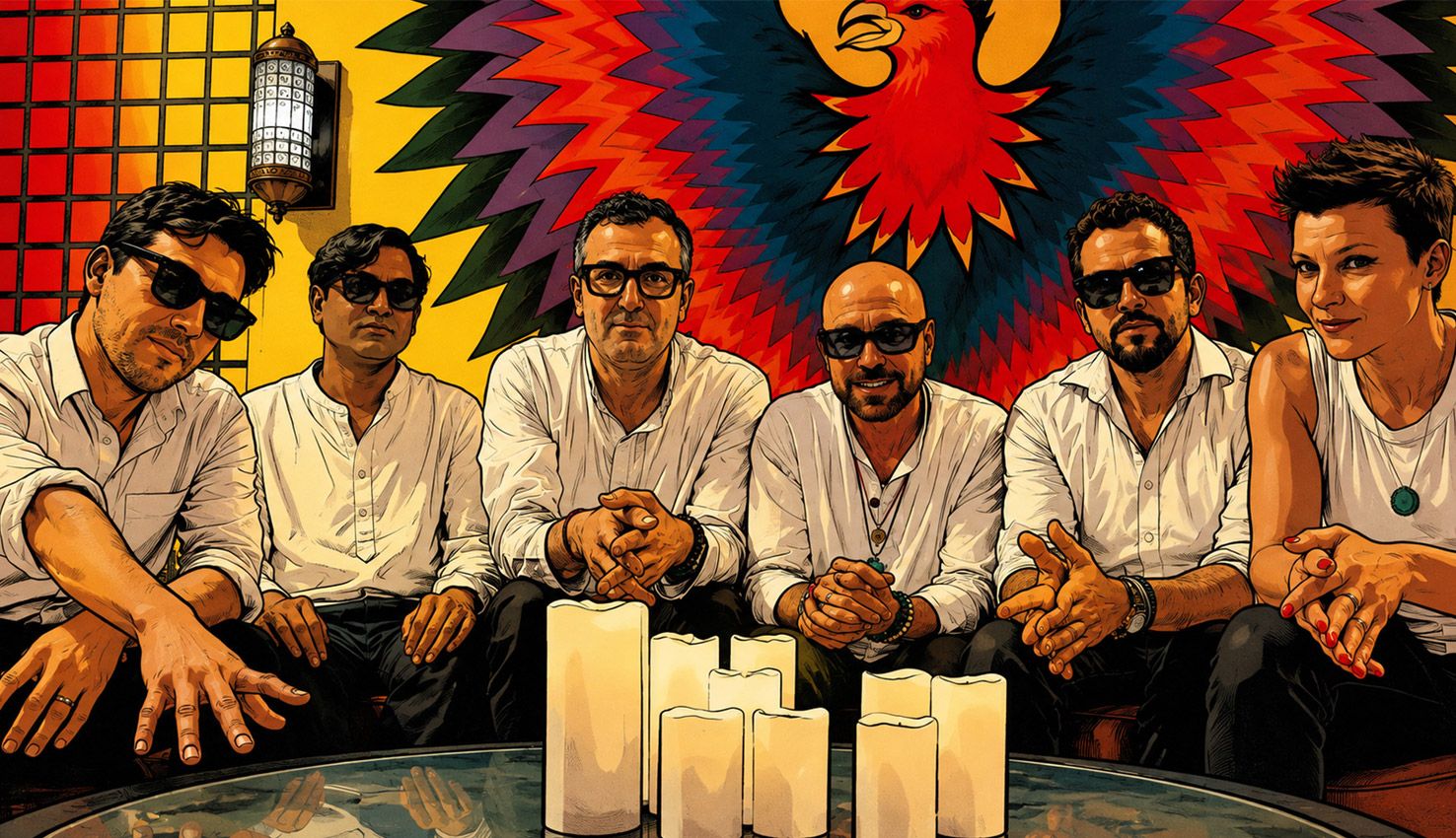
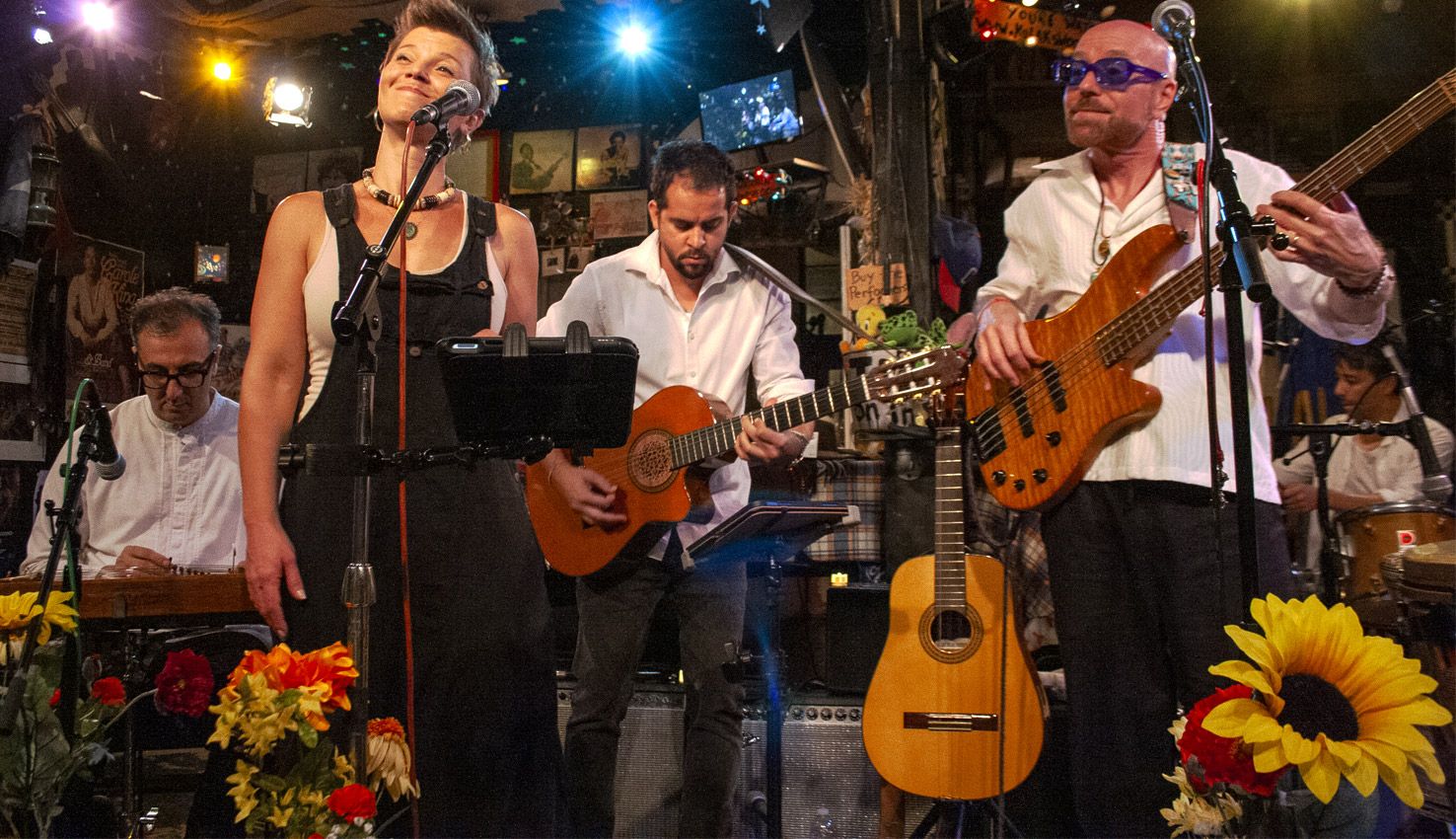
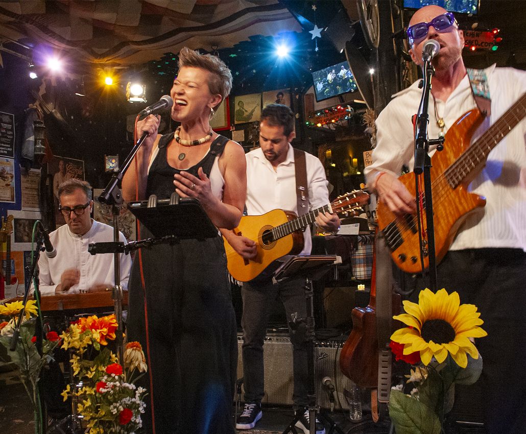
Until the band builds its audience, everyone wears white shirts and black pants — every show, every photoshoot, every video. Six people become one silhouette. When the audience grows, the look will change, which is what makes it a strategy rather than a costume.
The photography runs in two modes: formal shoots that establish who the band is, and live shots that prove it. The stage carries flowers and candles, which tell an audience how to be in the room — relax, lean in, take part.
Outcome: Six players and many paths read as one act before the first note.
Expression
A stamp is a mark made to be repeated.
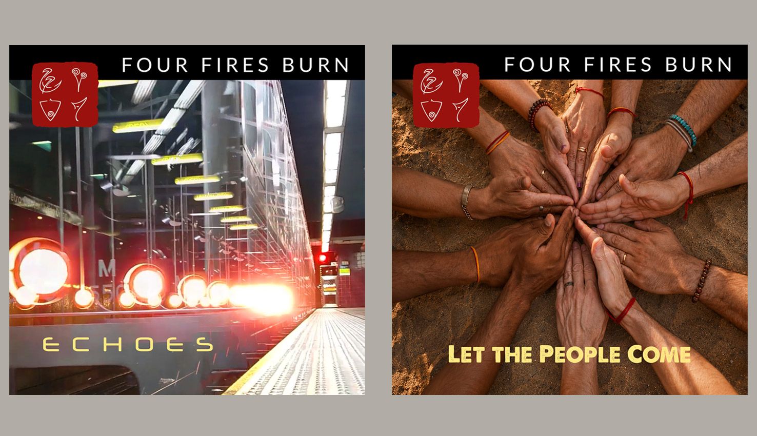
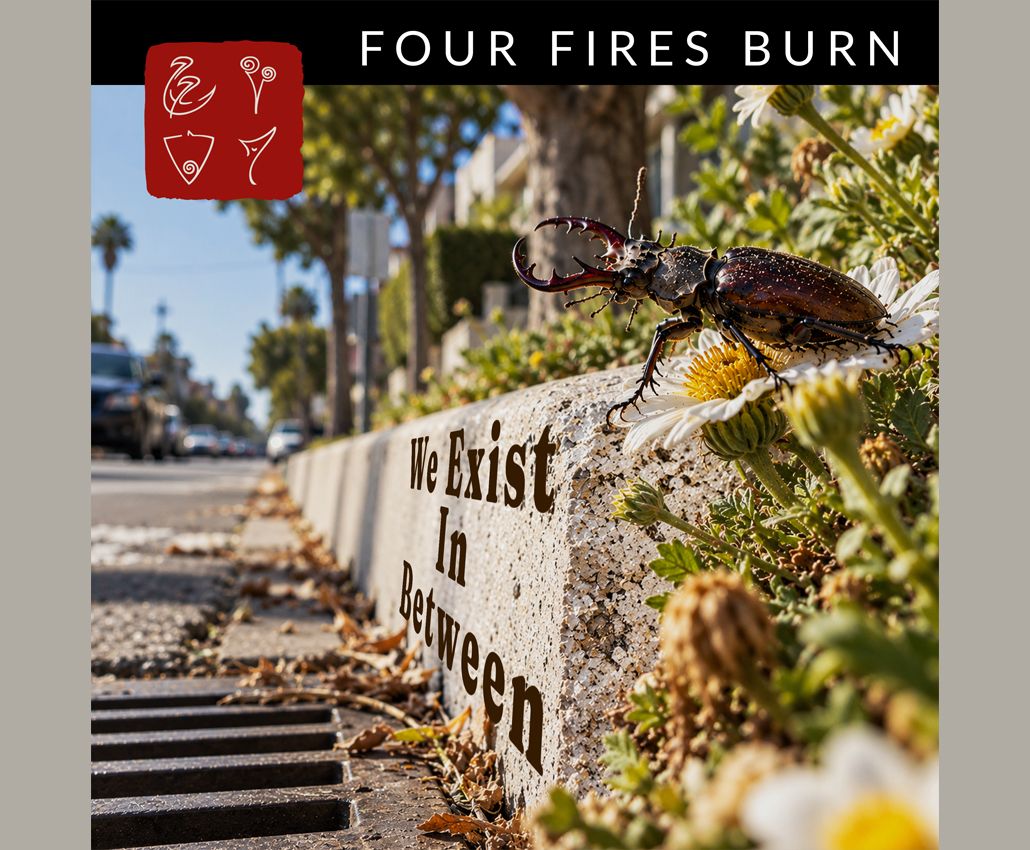
Each original member drew a personal glyph. I combined them in different arrangements until the stamp emerged — a Japanese-style seal that became the band's identity mark.
Every single follows the same release schema: the stamp, a black header, and its own photograph or illustration. When the series is complete, the singles become the album.
Outcome: A release system that makes every single recognizable on sight, and turns the series into an album.
Architecture
A brand that doesn't look like a template, built inside one.
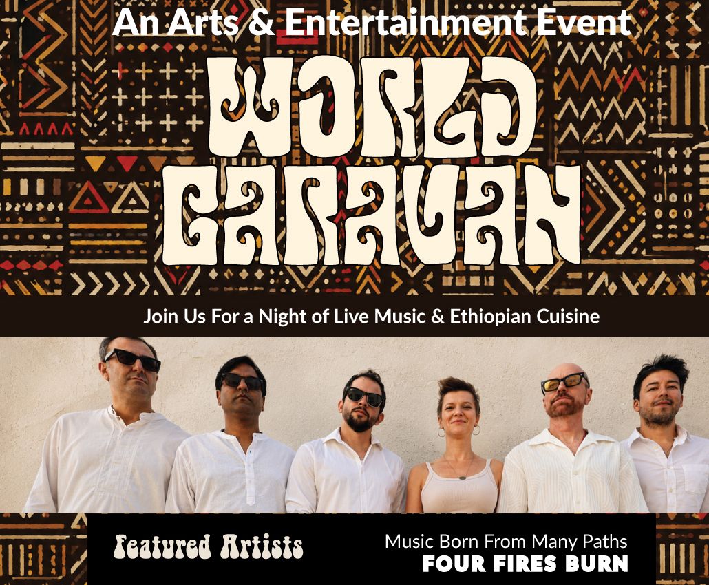
The band's website runs on Bandzoogle. I designed it within Bandzoogle's templates, with custom CSS, and supplied the copy and photography. The job was a relaxed, inviting look and tone that holds across the site, the Spotify and YouTube embeds, the show fliers on social, and the electronic press kit for booking.
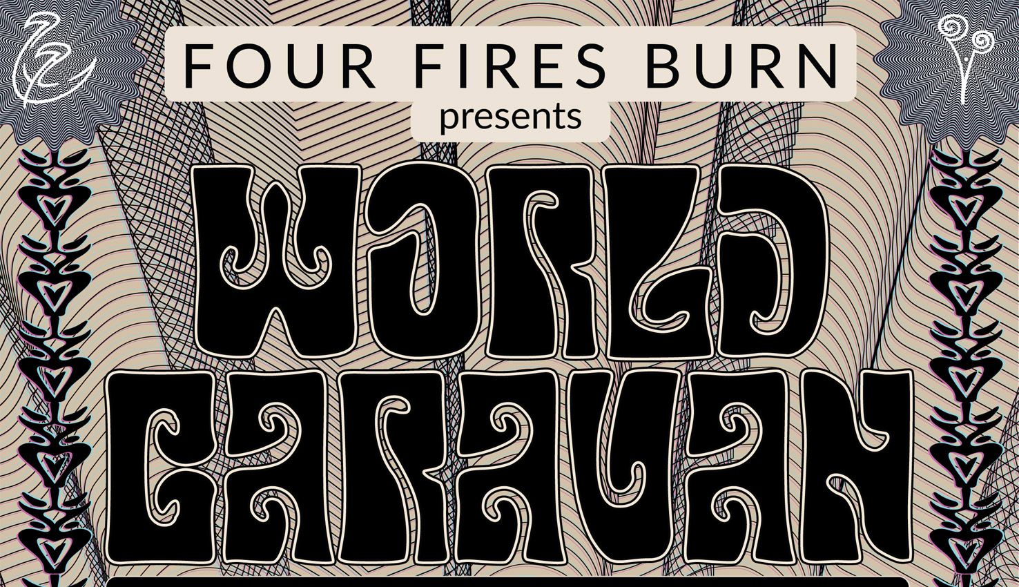
Then the same identity moved off the screen: votive candle stickers, a stage banner, QR codes that lead back to the site, and motion pieces for the Echoes release.
Outcome: One identity across screen, stage, and print — inside a template platform, with nothing that looks like a template.
In Closing
Most of this work wasn't graphic design. It was what the band wears, how the room feels, and when the music comes out — decisions six musicians had to believe in to carry them.
I direct them — on stage, in photoshoots, in wardrobe, and in the feel of the room — and I make most of it myself: the photography, the illustration and single art, the identity, the site, and the stage design. Concept to implementation.
The band went from an amateur web presence to a recurring night: The World Caravan, at Industry Cafe & Jazz in Culver City. I didn't book it. The brand was built so a room like that would take them seriously.